
Color theory is essential for creating harmonious and visually appealing designs. One key concept within color theory is complementary colors, which play a significant role in home furnishings and interior design.
Complementary colors are pairs of colors that, when combined, cancel each other out. This means that when mixed together, they create a grayscale color like white or black. In the context of interior design, complementary colors have the ability to enhance each other when used side by side, creating a striking visual impact.
Principles of Color Theory
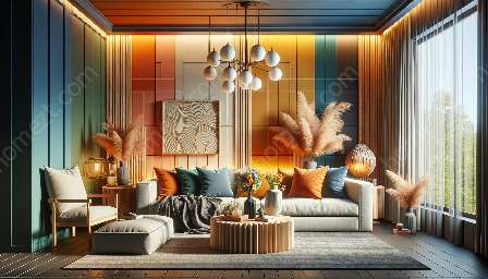
To understand complementary colors, it's important to grasp the basics of color theory. The color wheel, a fundamental tool in color theory, consists of primary, secondary, and tertiary colors. Complementary colors are positioned opposite each other on the color wheel, creating a balanced contrast when paired together. For example, yellow and purple, red and green, and blue and orange are classic examples of complementary color pairs.
Applications in Home Furnishings
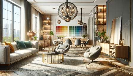
When applied to home furnishings, complementary colors can be used to create visually appealing and balanced interiors. For instance, a room dominated by blue walls can be complemented with accent pieces in orange to create a vibrant and complementary color scheme. Similarly, using green accessories to complement a predominantly red interior can create a visually stimulating environment.
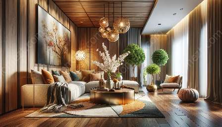
Complementary color combinations can also be utilized in textiles, such as rugs, cushions, and curtains, to add dynamic contrast and visual interest to a space. By strategically incorporating complementary colors, homeowners can achieve a harmonious and impactful design.
The Impact of Complementary Colors in Interior Design
Complementary colors play a crucial role in defining the mood and atmosphere of a space. By understanding the principles of color theory and how complementary colors interact, interior designers can create spaces that evoke specific emotions and feelings. For instance, pairing blue and orange can create a lively and energetic atmosphere, while combining red and green can impart a sense of balance and harmony.
Creating Cohesive Design Schemes
When utilizing complementary colors in home furnishings, it's important to maintain a sense of balance and cohesion. While the contrast between complementary colors can be visually striking, it's essential to ensure that the overall design remains harmonious. By incorporating varying shades and tones of complementary colors, designers can create cohesive and unified interiors.
In summary, the application of complementary colors in home furnishings is a powerful tool in interior design. By understanding the principles of color theory and the impact of complementary colors, homeowners and designers alike can create visually captivating and harmonious living spaces that reflect their personal style and aesthetic preferences.